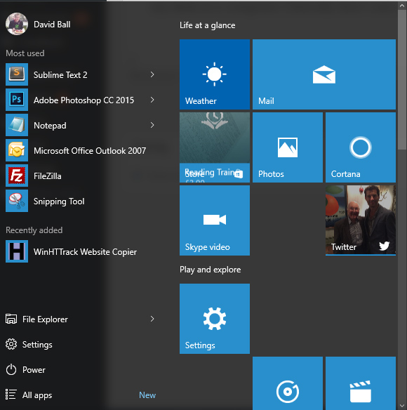
Although an improvement on 8, because you don’t have to horizontally scroll, Windows 10’s start menu is ridiculous and full of nonsense.
90% of the reasons for clicking the start menu is to find and launch an application. Which is why it’s annoying that it’s cluttered with panels of all sorts of other stuff.

Sports. Sports?! Why is that there?! I don’t care about sports, although Windows presumes that I do. Nope. Delete that panel.
Weather. If I cared about weather I’d look outside. Sometimes I check weather on my phone, but that’s usually because I’m taking my phone around with me. Sat at my desk at a computer I literally don’t care what the weather is like outside.
So I’ve deleted some panels, but now have gaps, which Windows hasn’t even bothered to reorganise for me. I have to do that manually, if I could be bothered. So now it’s even less useful than before – a potentially useful space which could be showing me information about apps that are installed is full of nonsense, and gaps where nonsense used to be. 
The “All apps” option, the thing I’ll use the most, and the reason I opened the start menu in the first place is relegated right to the bottom.