Leaving Silktide

So Monday was my last day working for Silktide. I’ve been there 10 years, so the move to a new company will no doubt be a shock to me!

Especially as I’m going back to agency work. Something I’ve not done in about 4 years since Silktide decided to give up on web design.

In 10 years I’ve seen the company change from web agency, into a software company working only on our own products. I miss working with clients, working on short projects you can hand over to a happy client. My problem with working on software is that you’re detached from the customer (unless obviously you’re in a role that deals with them). So it’ll be nice to speak to smart people and help them achieve whatever it is they need a web agency for.

The best time since the move to software was when we turned Nibbler (the free website testing tool) into a social experience, where users could claim websites and add to an online portfolio. Some users really loved it, especially the leaderboard showing the top 10. It was nice to get involved in that community and get to know users. That’s the sort of thing that really gets me excited, seeing people enjoy using a product I’ve worked on, and getting useful feedback. Unfortunately though, the decision was made to strip Nibbler back to be much more simple where there’s zero interaction.

Working on a string of projects that will never see the light of day, and one which the threat of it being discontinued hanging over it like the sword of Damocles saps quite a lot of my morale, so I’ve not been enjoying my work for quite a while, which is why I’m glad to be moving back to a type of work which I think will make me happier.

I’ll miss all the guys there a lot though, they’re a great, very talented bunch. And the office banter is fantastic. Hopefully I’ll still see them often, as I’m only moving a couple of doors down.

So, two life changing things in the space of a month, getting married, and switching jobs! Both took a lot of preparation and stress, which is now mostly almost over.

Desk dinos & robots

desk donos

I had a fairly substantial collection of robots and dinosaurs on my desk. I’ve brought them home. Not sure now what to do with them!

Leaving presents

lego dimensions

I love the Lego games, and was so happy to get this as a leaving present from the Silktide gang. I was going to do something more productive in the time before I start my new job, but I’ve now constructed this. It’d be rude not to play at least just a little bit…

Squattypotty

This is my other leaving present. Jess bought me a “SquattyPotty”. I had no idea what it was until I watched the hilarious video (here).

The science is sound, and Jess is clearly looking out for the health of my colon, but I had absolutely no idea how to react when given this as a present.

Nobody has ever given me a pooing aid before.

Out of software

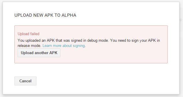
Biggest irritation right now, I don’t have an Adobe Creative Cloud licence at home, so can’t use Photoshop or Flash, and I wanted to use this time for working on a fun side project. It costs more than I’m willing to pay for only working on hobby stuff, dammit!

What I will be doing though is learning Zurb’s Foundation. I’ve always been a fan of Bootstrap, and this looks similar, so shouldn’t take long to learn.

So I got married

I’m quite lazy at updating this blog, so this isn’t exactly news straight off the press, but I thought it worth noting here.

Yes we got married 2 weeks ago, on the 31st of October! Here’s some photos:

“Previous” is the past, “Next” is what happened after

The Santander website seems to be confused what time is.

So, what is “time”? Oxford dictionary defines it as:

The indefinite continued progress of existence and events in the past, present, and future regarded as a whole.

But we know that already. We also know that things that happened previous to now happened in the past, right? And things that happened next were things that happened closer to now.

Someone tell that to Santander!

If you don’t know, Santander is a bank where I have an online account. And it seems every time I log in I find new horrible usability problems that just frustrate me. It’s quite easy to pick on bank websites for poor usability of course because every site I’ve used are rife with terrible usability problems. But today I’ll just pick on one small problem!

I was navigating the previous transactions where I saw this at the bottom of the page:

previous next buttons on Santander website

Standard pagination controls, we’ve seen them on a million websites, right? But in this case, they don’t make any sense.

The first screen of transactions are the most current, and to navigate to the previous transactions you have to press “Next”.

Wait a minute, that’s not right!

So I’m seeing older transactions, transactions that happened previous to the ones I’m looking at, and the word I have to click is one that actually means the opposite?!

So now I’m looking at transactions that happened a while ago, they’re actually from last month, and to go back to see the ones that happened after those, the ones that happened next, I have to press “Previous”!

As if this wasn’t weird enough, if I press “Next” a few times, I get an option to press “First” which doesn’t show me the first transactions I ever made, it shows me the most recent. Technically the LAST transactions I ever made!

I’ve seen this done of a few websites, and it doesn’t make sense to confuse your users with poor wording.

Sort it out Santander!

My opinions on using or not using Bootstrap

I found an article today titled “Strapless” by Aaron Gustafson (read it here) with some arguments for not using Bootstrap in your project. I use Bootstrap all the time, and I feel it saves a lot of time when starting a new project. Here’s my opinions on his points:

1. Bootstrap doesn’t solve your problems. Design is problem solving. The design decisions made by the creators/maintainers of Bootstrap solve their problems, not yours. You may share some of those problems—a need for responsive layouts, for example—but not others. You need a system that is tailored to solve your problems and only you (and your team) know what those problems are. Have you ever tried on an article of clothing that’s “one size fits all”? How well did it fit your body type? Unless you are absolutely average in all respects, probably not all that well. Solve your problems with your own Bootstrap-esque pattern library.

I actually agree with this point, but Bootstrap is a starting point, not a full solution. I like it because I can get something working really quickly, and can make the structure of a page, then refine it and change the look and feel later.

2. Bootstrap offers more than you’ll need. Bootstrap contains a lot of components and design patterns. It was created to address a wide array of project needs

Okay yeah, it is a bit bloated. It’s crammed full of stuff that you might never need – but actually that’s something I really like about it! If you suddenly need to add a carousel, there’s one built in. If you suddenly need to add a responsive wrapper for a Youtube video, it’s there. If you suddenly need to add a modal, it’s there. Same for lots of other really standard stuff.

Plus as long as you’re using the Bootstrap SCSS files and not the final exported version, you can pick and choose which sections you want, and comment-out the ones you don’t need. Here’s the _bootstrap.scss file for one of my projects where I’ve just uncommented the components that aren’t needed. These won’t be compiled into the final css, so there’s no bloat. But I can add them back in really easy if I need them. bootstrap file in phpstorm

If this isn’t how you include Bootstrap, you should (IMO anyway), and here’s an example project to get your started.

3. Differentiating yourself from you competition is harder. Bootstrap sites have a very common look to them.

Yeah but a Bootstrap site doesn’t have to look like a Bootstrap site! It’s a starting point, a framework. Sure if you keep the default theme, it will look like a Bootstrap site, but you can expand on that and add your own styles.

The major benefit I find is that it makes your markup standard, which means anyone who’s familiar with the Bootstrap classnames will save time when switching between projects and having to figure out how it all works!

Check out the rest of Aaron’s arguments here.

So, Glob is on the Google Play Store! Download it now for no reason

screenshot…although don’t get too excited, it’s completely pointless and doesn’t do much.

Although some of the sentences it generates can be quite amusing. And you can check back periodically to see other stupid stuff that he might have been doing.

I’ve blogged several times about Glob, read those if you’re interested in the progress. But for now lets just focus on the fact I’ve finished something. In my spare time and everything!

Get it here:

https://play.google.com/store/apps/details?id=com.DavidDickBall.Glob

From Beta to Production

After testing on a few devices (I still haven’t found a better way than actually having those devices though, which is quite limiting) I pressed the button that promotes the latest version into the app store. Yes, the actual Google play app store!

This means people could find my game and download it!

I can’t work out what those people would make of it though, as it’s so pointless. I might get some low ratings. Or I might get nothing at all. I assume there’s some sort of Google algorithm for what apps get shown at the top of the list, and without any likes or reviews or downloads I assume mine will be very low down.

If you’d be kind enough to rate, that would be very nice but don’t worry about going overboard, I know it isn’t exactly 5/5 material!

Anyway this was a bit of research to see what the entire process was like, and tbh it was pretty easy, and I’ve written down some things I need to remember, so it’s an unglorified success, so… on with the next project!

Final iterations and promotion to beta

So I’ve been making slight adjustments to the glob app (can’t really call it a game as it doesn’t do anything!). I had a problem with the percentage-based layout which wasn’t working quite how I expected, but I think was because the image borders weren’t quite flush with the anchors, causing slight percentage problems when scaled to resolutions much larger than I can in the editor preview.

The constant building and uploading, then fixing building and uploading cycle is getting a bit annoying. But I don’t know a better way!

One thing I did discover is you always need to increment the version when uploading a new file to the Google developer console.

incrementing version

You need to increment both numbers to make this work, which is a bit annoying if you forget, but is essential or it won’t be uploaded.

Promoted to Beta

So I pressed the button that promotes it to beta.

promoted to beta

This doesn’t mean anything, other than it’s now in a different tab in the developer console!

Automatic updating

It looks like Google takes care of any updating of the app that needs to be done. At least on alpha/beta (and I assume in production too). Just upload a new file and it pushes to phones, although this is a bit slow. Slower than I’d like, so I did still have to email the file to myself to test faster.

My problems with percentage layouts in Unity

In my latest app (mostly just to test interface, and the experience of the Google app store) I’m having problems scaling an image based on a percentage of the screen.

Not all phones have the same resolution or aspect ratio

This is obvious right? So I wanted my interface to scale to all types of aspect ratios. Here’s what I wanted it to look like:

jurdles

So to test, I’ve been creating a build and emailing to myself to open on my phone (Nexus 5). And what I found was that Glob’s eyeball was being scaled a bit too big:

globs funny eye

I’m not actually sure why this is happening because I thought I’d got this figured out. The bounding box that Unity allows you to draw around each item for scaling, I thought was best to be the same as the image boundary. Like this:

blob image bounding box

Which I also did with the graphic of the eyeball (it’s separate because it’s an animation). Like this:

globs eye

I made it super wide so it can scale (maybe this is the problem? Not sure, but it seemed to help when I tried the first time).

The above approach looks great in any aspect ratio I can create in the editor. I’ve tried all the example default resolutions and tried a few more but it always looks good. But on a phone… not so much.

I also tried this on a friend’s phone (a Google 1+1) with a much larger resolution screen, and that looks even weirder:

Glob on Tim's 1+1

Look at that eyeball!! Not sure why it’s scaled even larger than the other image. Also the text is tiny. It’s supposed to scale to fit the area but hasn’t Perhaps because I set a max size?

I’m continuing to play with this, I uploaded to the Google play store (I wrote about that here) and if you’re interested, you can download it here (currently in Alpha):

https://play.google.com/apps/testing/com.DavidDickBall.Glob

EDIT – I think I’ve solved this but not quite sure. I think the problem was the anchors not being exactly flush with the image boundaries, causing scaling differences. I’ve made it more exact, as well as nesting the eye inside the body graphic (why not really), and it seems to work ok now, but needs just a bit more testing. 

flush

So I’m uploading something to the Google Play store

New game

glob
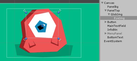
To call it a “game” is a bit misleading. This latest project is more of a random gibberish generator, something I wanted to create which was quick and no stress. Although I had the silly idea of showing how long since you last opened the app, which it turns out was a nightmare. I hate anything to do with time. Especially DateTime.

Anyway I called it “What’s Glob been up to?” a random generator that tells you some nonsense that Glob (the little alien blob) has been doing since you last checked. If you check again after just a few minutes it’ll say “Glob has just been doing x” but if you check after an hour, it’ll tell you something a bit more interesting and lengthy.

Testing on my phone

So when the app was mostly finished I exported to my phone. A process I wrote about here. This step actually took a long time of going back and forward, to get the font size correct, and make sure the interface elements scaled as they should. Turns out, the Unity way of doing percentage widths is quite tricky! I longed for CSS (especially flexbox), which makes more sense to me.


Signing up for a Google developer account

This part was easy, and you can do it by going here. It costs $25, which is a bargain compared to the Apple app store account tbh!

After this, I wanted to upload my apk file to the “Alpha” section.

Digital signing

First problem, uploading my app failed.

upload failed

And that’s because it wasn’t digitally signed. I had no idea about this step, but it’s basically a file you need on your computer with some sort of credentials. Turns out I can use Unity to add this, and I found a YouTube video of this friendly chap which explained how to do it. Pretty easy really.

The most difficult part of that is what to call myself! I don’t have a company, so just used my name. Apparently you’re supposed to keep and use the same file for all your apps. So I’ve kept the file somewhere agnostic from a project.

uploading

Ooh it’s uploading now!!!

Entering details

So there’s loads of details you need to enter about the app after it’s uploaded.

Standard stuff, upload an icon, some screenshots, provide description, and even do a content questionnaire, which asks some pretty oddly-worded questions like:

poo coils

“Flatulence cloud”??!!!

“Poo coils”?!!!

Nope. This project doesn’t have any of those.

nazi

No it doesn’t!!! And why are they singling out the Nazis? What about all the other totalitarian evil dictatorships? Are they allowed?

So in the end I got these ratings:

content ratings


So the last thing I needed to do was upload icons for every one of their specific aspect rations which was a bit annoying. I know it’s nice to give me the control, but can’t they just resize them?!

The last one is a bit odd:

tv?!!

I don’t think I want this working on a TV. It’ll look pretty crap if it did. It’s made for a portrait aspect ratio. Good thought though, how can I make my app work in both aspect ratios? I haven’t found an alternative to media queries yet. 

Alpha/Beta etc

So you can choose to put the app into alpha or beta before publishing. As I’ve no idea I chose alpha, also because I want to see the full extend of the process!

Then I pressed publish.

Scary stuff!

Now to wait a bit for it to be approved…