Unity has a 8 digit Hex color, and that’s insane!

hex in unity

I noticed something today. Unity has a hex value for colours, which is great – I hate having to remember RGB values between various graphics programs. But Unity’s hex value has 8 digits (see above), which is INSANE! Hex should be 6, it’s always been 6. It’s literally Greek for 6!  Continue reading Unity has a 8 digit Hex color, and that’s insane!

Particles in Unity appearing in front of mesh

I had a weird bug in Unity today where particles that are supposed to be in the background were actually appearing in front of meshes that are closer to the camera.

After quite a lot of searching, the solution is actually simple, but wasn’t obvious so I thought I’d write it here.

So my particles are exactly where they are supposed to be, behind the land mesh. But are appearing in front (see image above).

Unity particles behind mesh

This is actually caused by the particles being scaled. I first found out about it from this thread on Unity Answers, linking to this forum post about it.

If I set the particles’ scale to 1, it resolves itself. I thought I’d have to muck about with sorting orders or layers (still not got to grips with those in Unity yet. Doesn’t seem to change anything to me).

What I did in 2015

2015 is over and dead. But from the ashes rises 2016. Which it is today. January the 1st in fact.

Here’s what I did last year:

Helen and David in Carcassonne

  • Helped create an interactive display for the museum.

Joseph Wright exhibition at the Museum

  • Spent ages on a game about a giant space turd, which nobody liked, and even I hated by the end. I uploaded it to Newgrounds – see here (requires Firefox & the Unity player).
  • Grew a beard, then shaved it off.

David with a beard

  • Created some graphics for my brother’s card game – which he still hasn’t finished:
  • Created this blog! I’ve listed the most viewed articles from 2015 here.

My BotSumo game is now on the Android store

The simple & quite mediocre Android game (I’ve written about it before, here) is now on the Google play store. To download the game, go here:

https://play.google.com/store/apps/details?id=com.DavidDickBall.RoboSumo

It would be so great if you could please rate it, and leave a comment. If you find a bug or have a suggestion, leave that in the comments too – or tweet me @davidonionball.

Here’s a gameplay video!

The controls are dead simple, you have one button to drive the character forward. It spins by default, so it’s about timing. There’s an on-screen button for 2 players, the idea is you grab a friend and play using the same screen, just like the Microbattles Android games.

It’s only available on Android?

Yes, I’m going to only make games for Android whilst I’m doing it as a hobby, as it costs money for a licence to publish to the Apple App store. And if I’m not making any money out of this hobby, there’s not much point!

Want to get an email whenever I publish something new?

Good idea! Subscribe to this blog, which is about various things I’m interested in, or join this newsletter which is ONLY about games I make.

BotSumo game almost finished!

I think I’ve only written about this BotSumo game on IndieDB, (where I’ve been calling it “RoboSumo” – but have decided to rename it because “RoboSumo” is already taken).

Recently I changed it from the light & quite garish colour theme of this:

Screenshot_2015-12-07-00-04-30

…to this:

Bot Sumo

Which I quite like. The colours from this fan poster of “Ready Player 1” inspired me. Also I went full isometric, because isometric is cool (I’ve been collecting this board on Pinterest with images for inspiration).

So the idea of the game is simple, to push the other player off the platform. I’ve introduced pickups too, which make the player slightly larger, and double its mass (the game uses physics objects), making it easier to push the other player.

BotSumo - larger player

The controls are dead simple, you have one button to drive the character forward. It spins by default, so it’s about timing. There’s an on-screen button for 2 players, the idea is you grab a friend and play using the same screen, just like the Microbattles Android games.

So I’m about to start uploading it to the Google Play store (which always takes longer than I expect). But after that I’ll need testers. So if you’re interested in testing this game and have an Android phone, submit your email on this form, and I’ll send you an email.

So, Glob is on the Google Play Store! Download it now for no reason

screenshot…although don’t get too excited, it’s completely pointless and doesn’t do much.

Although some of the sentences it generates can be quite amusing. And you can check back periodically to see other stupid stuff that he might have been doing.

I’ve blogged several times about Glob, read those if you’re interested in the progress. But for now lets just focus on the fact I’ve finished something. In my spare time and everything!

Get it here:

https://play.google.com/store/apps/details?id=com.DavidDickBall.Glob

From Beta to Production

After testing on a few devices (I still haven’t found a better way than actually having those devices though, which is quite limiting) I pressed the button that promotes the latest version into the app store. Yes, the actual Google play app store!

This means people could find my game and download it!

I can’t work out what those people would make of it though, as it’s so pointless. I might get some low ratings. Or I might get nothing at all. I assume there’s some sort of Google algorithm for what apps get shown at the top of the list, and without any likes or reviews or downloads I assume mine will be very low down.

If you’d be kind enough to rate, that would be very nice but don’t worry about going overboard, I know it isn’t exactly 5/5 material!

Anyway this was a bit of research to see what the entire process was like, and tbh it was pretty easy, and I’ve written down some things I need to remember, so it’s an unglorified success, so… on with the next project!

Final iterations and promotion to beta

So I’ve been making slight adjustments to the glob app (can’t really call it a game as it doesn’t do anything!). I had a problem with the percentage-based layout which wasn’t working quite how I expected, but I think was because the image borders weren’t quite flush with the anchors, causing slight percentage problems when scaled to resolutions much larger than I can in the editor preview.

The constant building and uploading, then fixing building and uploading cycle is getting a bit annoying. But I don’t know a better way!

One thing I did discover is you always need to increment the version when uploading a new file to the Google developer console.

incrementing version

You need to increment both numbers to make this work, which is a bit annoying if you forget, but is essential or it won’t be uploaded.

Promoted to Beta

So I pressed the button that promotes it to beta.

promoted to beta

This doesn’t mean anything, other than it’s now in a different tab in the developer console!

Automatic updating

It looks like Google takes care of any updating of the app that needs to be done. At least on alpha/beta (and I assume in production too). Just upload a new file and it pushes to phones, although this is a bit slow. Slower than I’d like, so I did still have to email the file to myself to test faster.

My problems with percentage layouts in Unity

In my latest app (mostly just to test interface, and the experience of the Google app store) I’m having problems scaling an image based on a percentage of the screen.

Not all phones have the same resolution or aspect ratio

This is obvious right? So I wanted my interface to scale to all types of aspect ratios. Here’s what I wanted it to look like:

jurdles

So to test, I’ve been creating a build and emailing to myself to open on my phone (Nexus 5). And what I found was that Glob’s eyeball was being scaled a bit too big:

globs funny eye

I’m not actually sure why this is happening because I thought I’d got this figured out. The bounding box that Unity allows you to draw around each item for scaling, I thought was best to be the same as the image boundary. Like this:

blob image bounding box

Which I also did with the graphic of the eyeball (it’s separate because it’s an animation). Like this:

globs eye

I made it super wide so it can scale (maybe this is the problem? Not sure, but it seemed to help when I tried the first time).

The above approach looks great in any aspect ratio I can create in the editor. I’ve tried all the example default resolutions and tried a few more but it always looks good. But on a phone… not so much.

I also tried this on a friend’s phone (a Google 1+1) with a much larger resolution screen, and that looks even weirder:

Glob on Tim's 1+1

Look at that eyeball!! Not sure why it’s scaled even larger than the other image. Also the text is tiny. It’s supposed to scale to fit the area but hasn’t Perhaps because I set a max size?

I’m continuing to play with this, I uploaded to the Google play store (I wrote about that here) and if you’re interested, you can download it here (currently in Alpha):

https://play.google.com/apps/testing/com.DavidDickBall.Glob

EDIT – I think I’ve solved this but not quite sure. I think the problem was the anchors not being exactly flush with the image boundaries, causing scaling differences. I’ve made it more exact, as well as nesting the eye inside the body graphic (why not really), and it seems to work ok now, but needs just a bit more testing. 

flush

So I’m uploading something to the Google Play store

New game

globTo call it a “game” is a bit misleading. This latest project is more of a random gibberish generator, something I wanted to create which was quick and no stress. Although I had the silly idea of showing how long since you last opened the app, which it turns out was a nightmare. I hate anything to do with time. Especially DateTime.

Anyway I called it “What’s Glob been up to?” a random generator that tells you some nonsense that Glob (the little alien blob) has been doing since you last checked. If you check again after just a few minutes it’ll say “Glob has just been doing x” but if you check after an hour, it’ll tell you something a bit more interesting and lengthy.

Testing on my phone

So when the app was mostly finished I exported to my phone. A process I wrote about here. This step actually took a long time of going back and forward, to get the font size correct, and make sure the interface elements scaled as they should. Turns out, the Unity way of doing percentage widths is quite tricky! I longed for CSS (especially flexbox), which makes more sense to me.


Signing up for a Google developer account

This part was easy, and you can do it by going here. It costs $25, which is a bargain compared to the Apple app store account tbh!

After this, I wanted to upload my apk file to the “Alpha” section.

Digital signing

First problem, uploading my app failed.
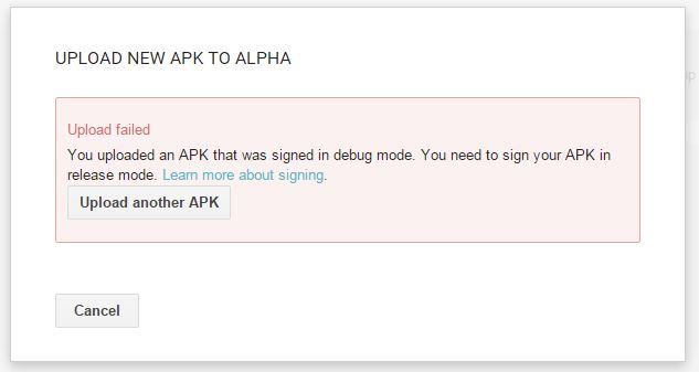
upload failed

And that’s because it wasn’t digitally signed. I had no idea about this step, but it’s basically a file you need on your computer with some sort of credentials. Turns out I can use Unity to add this, and I found a YouTube video of this friendly chap which explained how to do it. Pretty easy really.

The most difficult part of that is what to call myself! I don’t have a company, so just used my name. Apparently you’re supposed to keep and use the same file for all your apps. So I’ve kept the file somewhere agnostic from a project.

uploading

Ooh it’s uploading now!!!

Entering details

So there’s loads of details you need to enter about the app after it’s uploaded.

Standard stuff, upload an icon, some screenshots, provide description, and even do a content questionnaire, which asks some pretty oddly-worded questions like:

poo coils

“Flatulence cloud”??!!!

“Poo coils”?!!!

Nope. This project doesn’t have any of those.

nazi

No it doesn’t!!! And why are they singling out the Nazis? What about all the other totalitarian evil dictatorships? Are they allowed?

So in the end I got these ratings:

content ratings


So the last thing I needed to do was upload icons for every one of their specific aspect rations which was a bit annoying. I know it’s nice to give me the control, but can’t they just resize them?!

The last one is a bit odd:

tv?!!

I don’t think I want this working on a TV. It’ll look pretty crap if it did. It’s made for a portrait aspect ratio. Good thought though, how can I make my app work in both aspect ratios? I haven’t found an alternative to media queries yet. 

Alpha/Beta etc

So you can choose to put the app into alpha or beta before publishing. As I’ve no idea I chose alpha, also because I want to see the full extend of the process!

Then I pressed publish.

Scary stuff!

Now to wait a bit for it to be approved…